Overview
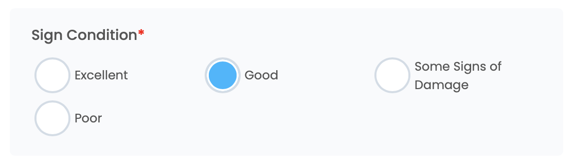
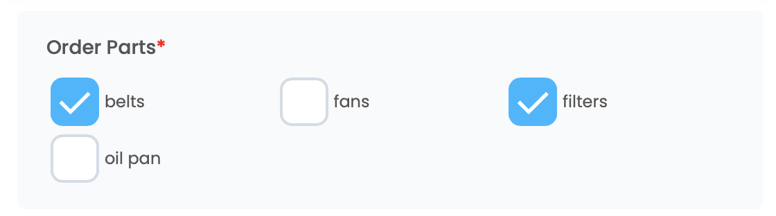
The Option List field lets you add multiple-choice answer selections for a specific question on your form. You can require single selections or allow multiple selections per list.
For example, let's say you're creating a customer satisfaction survey that asks respondents to rate their overall experience. Instead of having respondents manually type their response, you can add an Option List to provide a multiple-choice list of pre-defined rating options for users to choose from (e.g., Excellent, Good, Fair, Poor).
The Options List saves time and reduces errors because users don't have to type out their answers. Plus, it ensures that all responses are consistent, which makes analyzing the data easier and more accurate.
How to Add an Option List Field
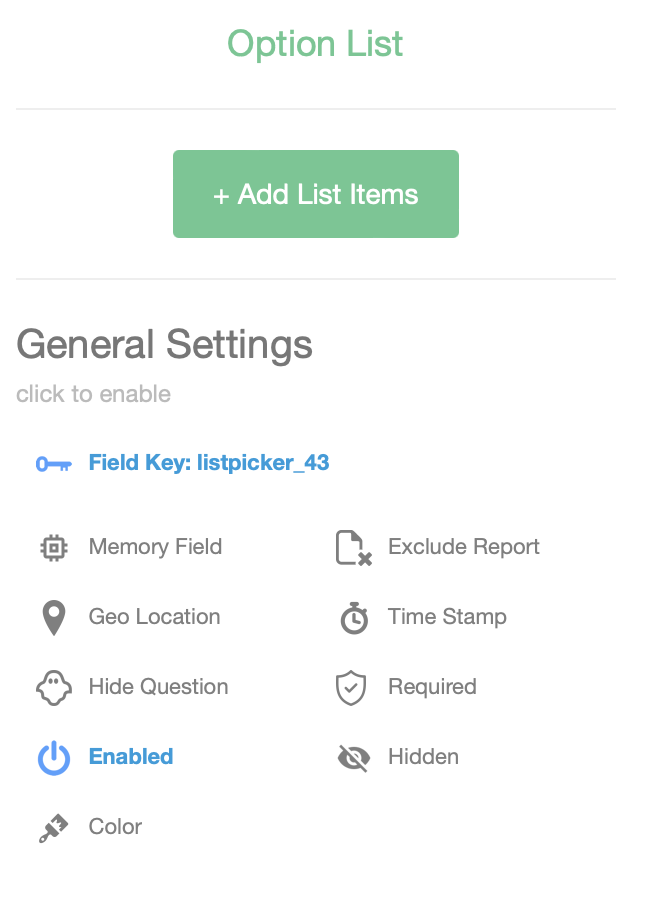
- In the Form Builder, select Option List from the Add Fields menu on the left to add it to your form.
- Select Add List Items and create your list of options for users to choose from.
- To allow users to select multiple options, select Allow Multi Select.
(App View)
Configuration
| Setting | Description |
|---|---|
| Field Label | The label displayed for the field. This is usually displayed at the top left corner above the field. |
| Field Key | A Key used to reference the field in submission data. The key is also used to reference the field in rules and calculations. |
| Number of columns for Phones | The number of checkbox columns to display on phones. |
| Number of columns for Tablets | The number of checkbox columns to display on tablets. |
| Allow Multi-Selection | If checked allows more that one option to be chosen. |
| Memory Field | If a previous form containing the same Field Key has a value set, it's value will be pre-populated for this field when the form is first opened. |
| Rule | A JavaScript rule snippet that allows you to perform actions on fields or sections within the form. The actions can include hide, show, enable, disable, showSection and hideSection. Rules are executed on field value changes and when the form is opened. ex. if ($field1$ > 23) { hide(); } else { show(); } (Please see the Introduction to Rules Document for more information) |
| Required | Sets the field to have required input. You will not be able to submit the form until this field has valid input. |
| Enabled | If not set the field will be visible but cannot be edited or set to accept new input. |
| Hide Field Label | Hides the Field Label. |
| Hidden | If enabled the field and all labels are not visible. |
| Exclude From Reports | If checked, the field will be excluded from HTML and PDF reports and will also be excluded from Excel and CSV exports. |
| Capture Geo Location | Capture the current latitude and longitude when the acknowledgment button is clicked. |
| Capture Time Stamp | Capture the current date and time when the acknowledgment button is clicked. |
| Alert Type | Choose a theme to change the background and font colors of the field cell as displayed in the apps. |
| Values | A list of values that will be populated in the list. |
| Value - Name | The displayed value shown in the List. |
| Value - Value | The value that is sent when the form is submitted. |